Aetna: Balancing Creativity and Brand Consistency
Adhering to your brand guidelines isn’t just about following rules. It actually makes your brand more memorable! When everything looks and feels consistent, people recognize you, trust you, and keep coming back. Plus, it helps you stand out from competitors, makes your marketing more effective, and can even boost your business growth.
Designing for Trust
I got to put this into practice on a recent project for Aetna. They needed a direct mail campaign for their Medicare members, and the challenge was communicating clearly and accessibly while staying within strict brand guidelines. My role was to design a piece that felt approachable, built trust, and kept the brand consistent across both print and digital.
Audience insights:
- Medicare members 65 years old +
- 58% women
- May have issues with mobility


Behind the Design
Here’s a breakdown of the direct mailer and the choices I made to adhere to the brand guidelines.

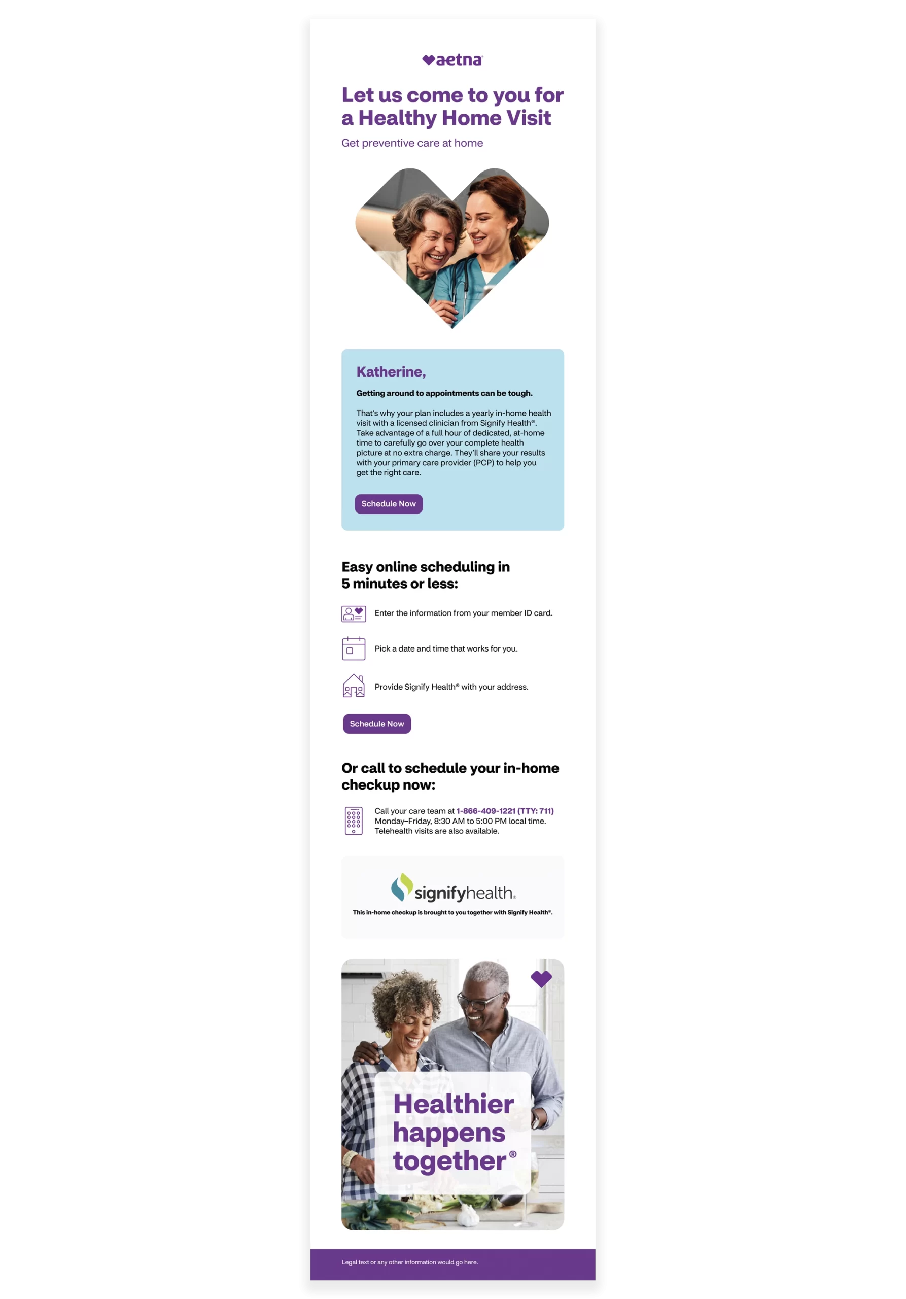
Front Cover
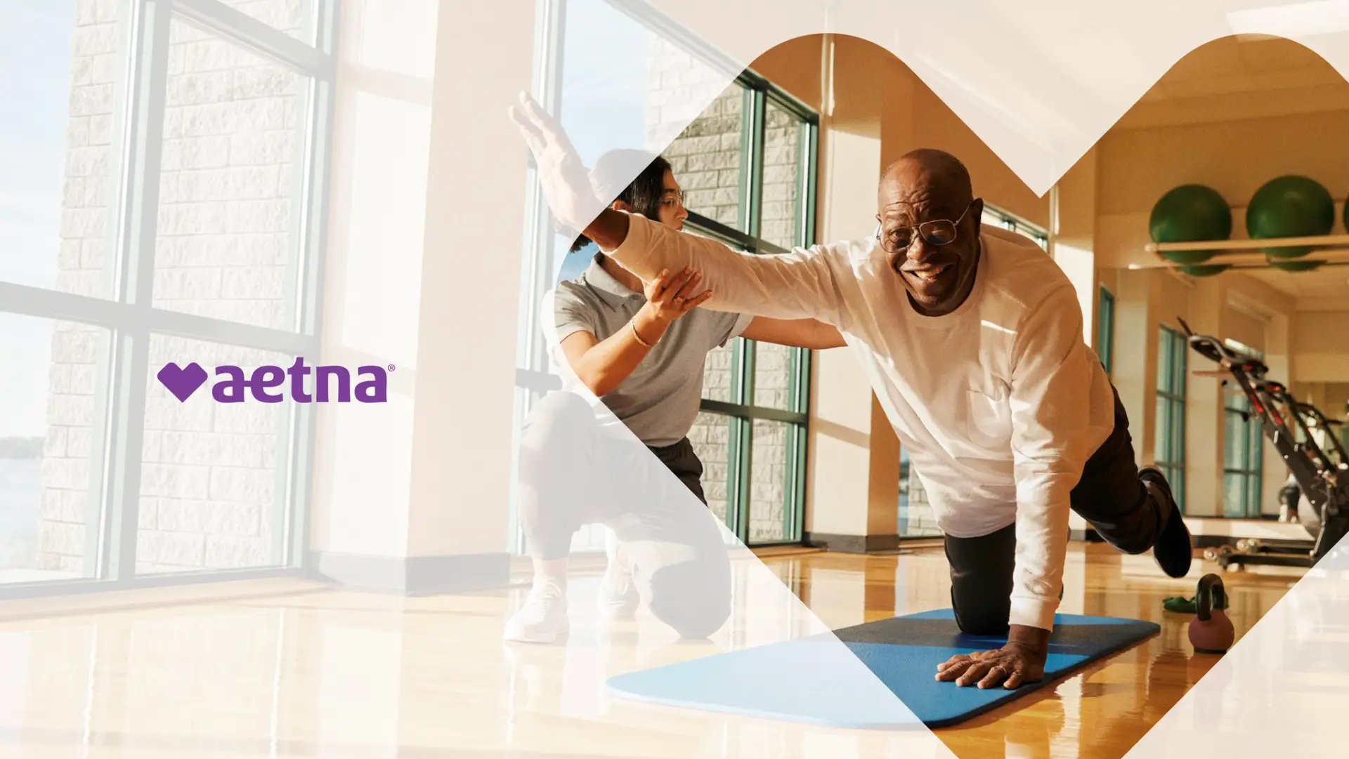
Aetna, a subsidiary of CVS Health, shares key elements of CVS’s branding. Their most recognizable and meaningful symbol is the CVS Health Heart. In Aetna’s brand guidelines, they provide a set of “heart container” shapes designed to hold images that represent everyday, meaningful moments. These containers can’t be altered or cropped, which sometimes creates a challenge when working across different formats.
For this postcard, I used one of Aetna’s approved heart containers (highlighted in orange) and paired it with imagery that conveys a genuine moment of connection.
Back Cover
The original copy for the back only included disclaimer text, so I expanded the design to feel more engaging. I incorporated the recognizable tagline “Healthier happens together” to reinforce the brand’s message and paired it with supportive imagery. To keep everything aligned with Aetna’s guidelines, I used the approved rounded-corner image containers, which helped make the postcard feel more personable and approachable.


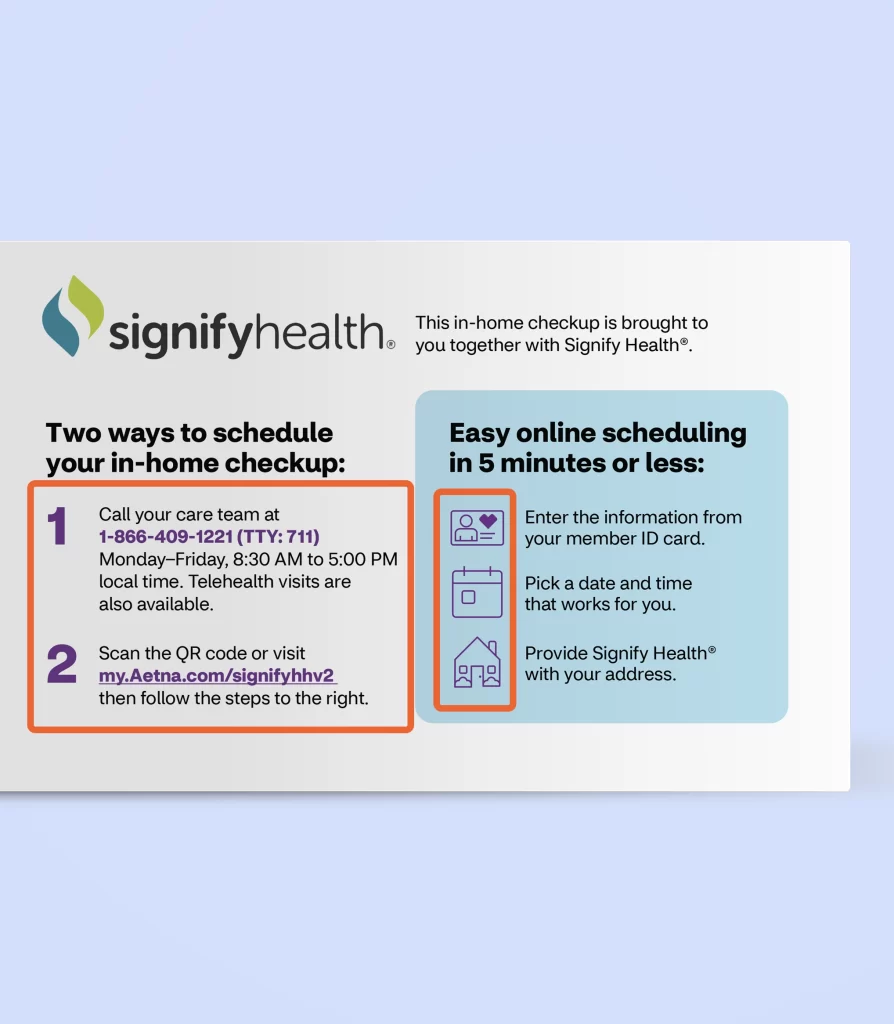
Inside Left
One of the client’s main requests was to make the information easy to digest for the audience. Originally, the call-to-action (highlighted in the orange circle) was buried in the paragraph, which made it easy to miss. To give it more impact, I pulled it out and placed it next to imagery so readers can quickly spot how to schedule an appointment.
Inside Right
In the first orange-highlighted square, I reworked the sentence and placed it just before the online scheduling instructions to make the connection clearer. I also added the phrase “then follow the steps to the right” to guide the reader smoothly through the process.
To keep everything on-brand, I incorporated Aetna’s approved icons, which reinforced consistency and strengthened brand recognition.
When working on a direct mail campaign, I typically create an accompanying email to support the initiative. An email campaign helps reinforce the message from the direct mail piece, providing an additional touchpoint for the audience and increasing engagement. It also allows for more immediate calls to action, such as clickable links or buttons, that can drive quick responses and further strengthen the overall campaign’s effectiveness.
Final Thoughts
The overall feedback on the direct mail campaign was very positive. The client had only minor notes, and they felt the design stayed true to Aetna’s branding guidelines. It was rewarding to see the piece resonate while keeping everything consistent, approachable, and on-brand.