Koji Packaging
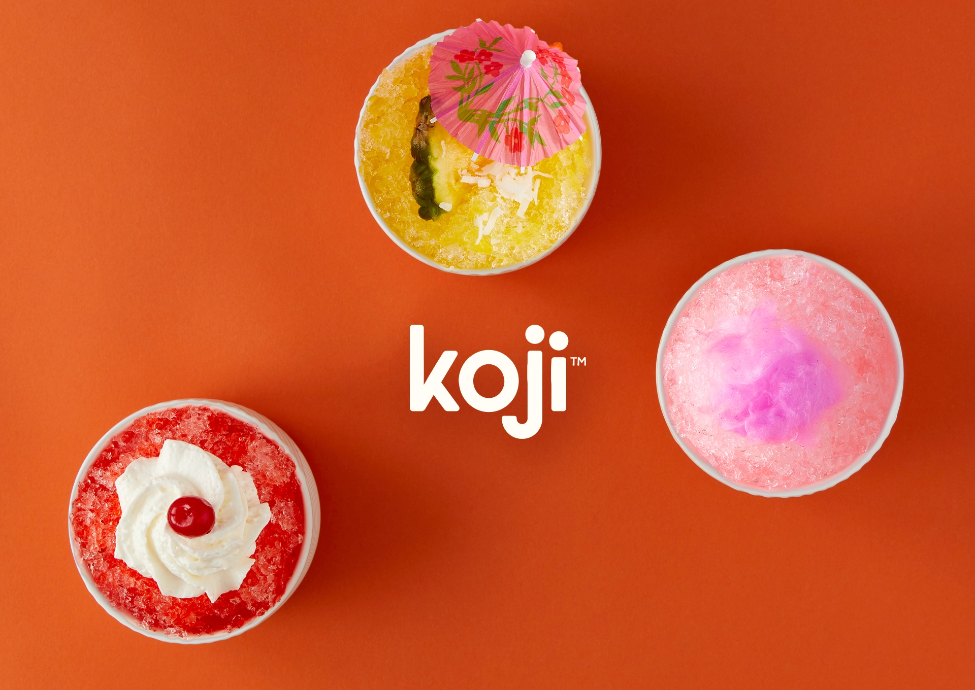
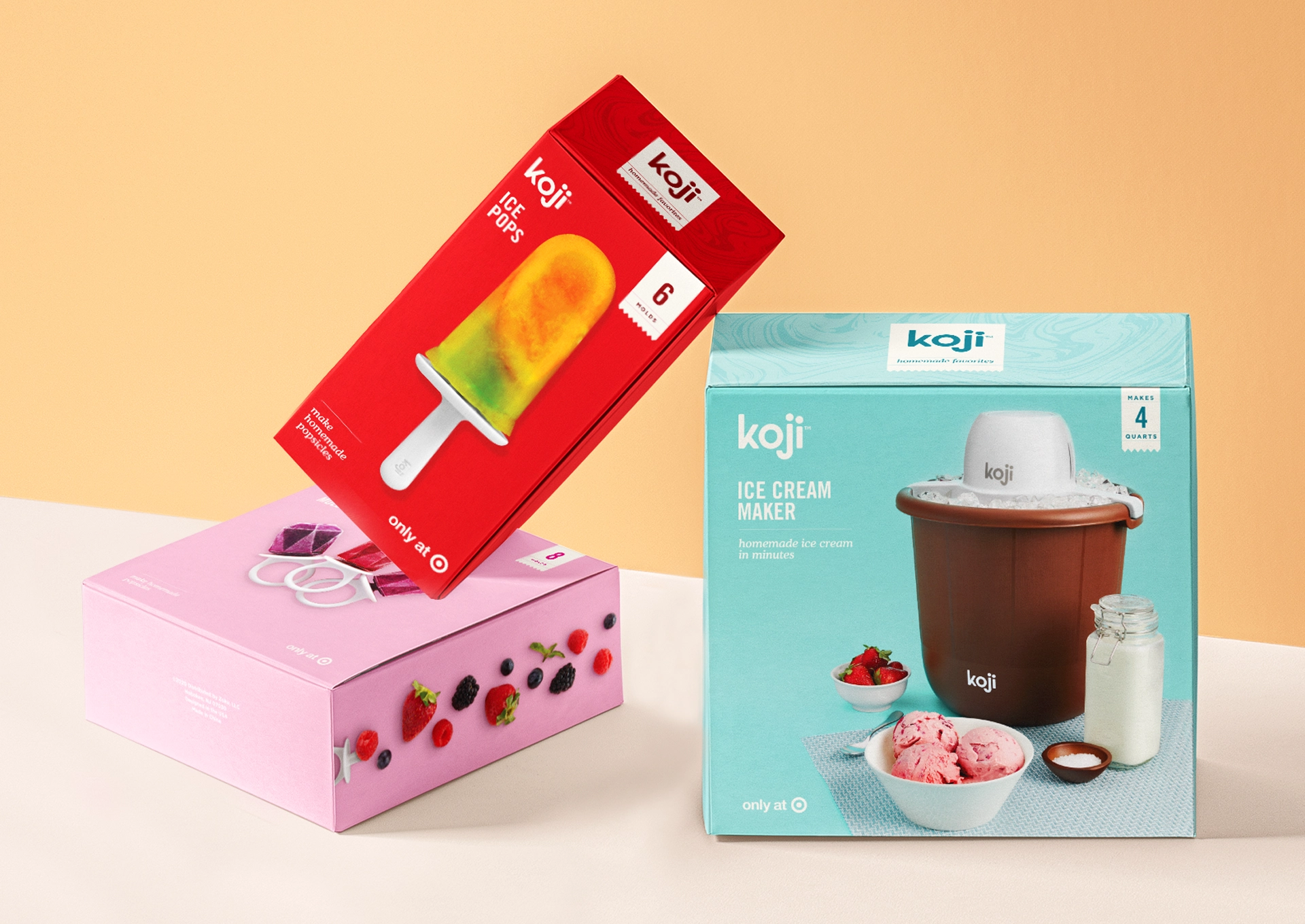
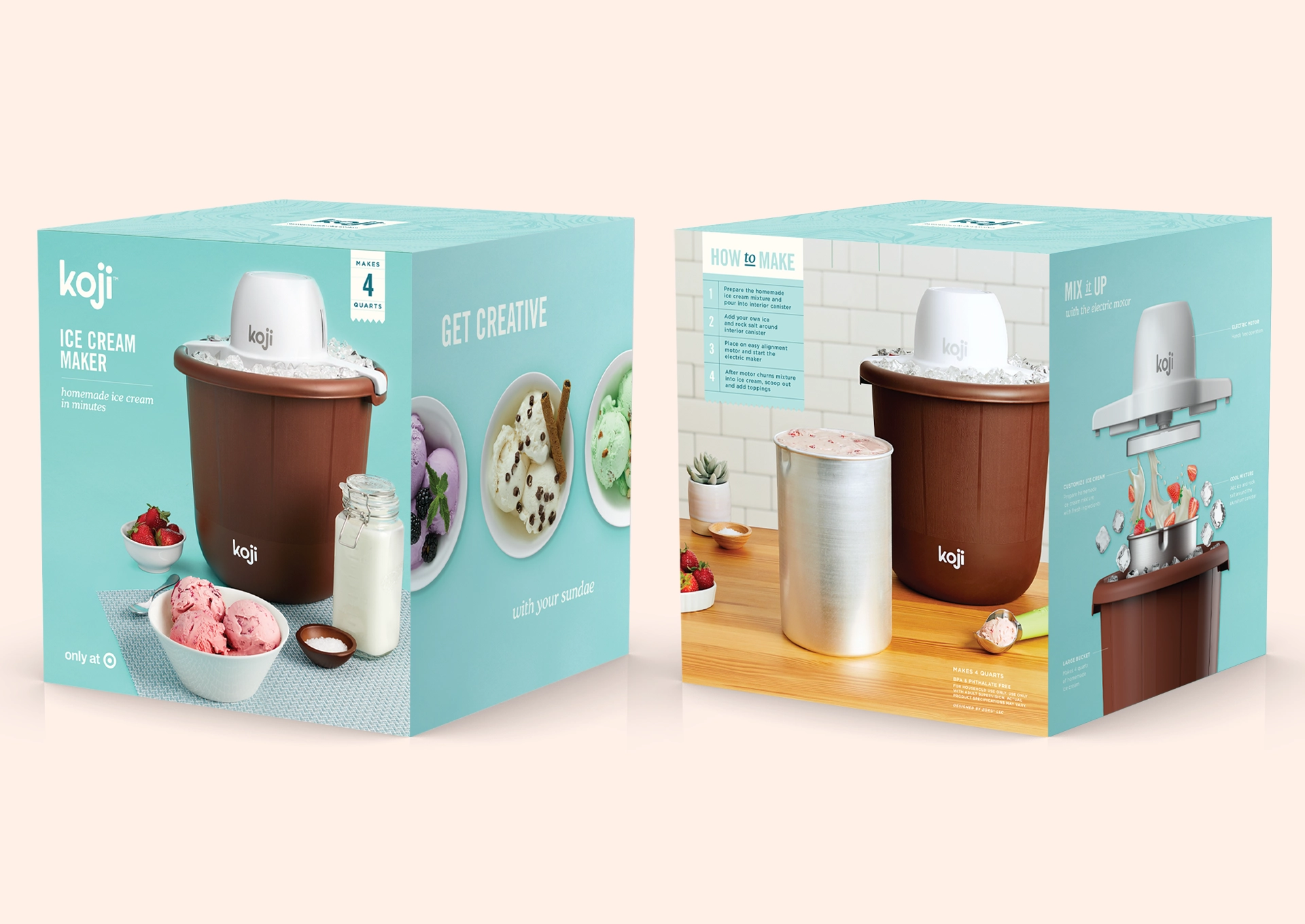
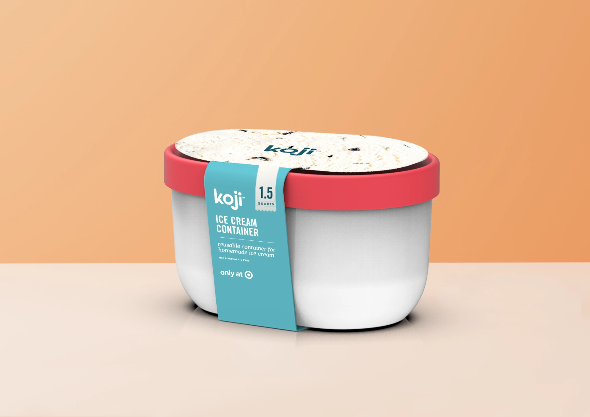
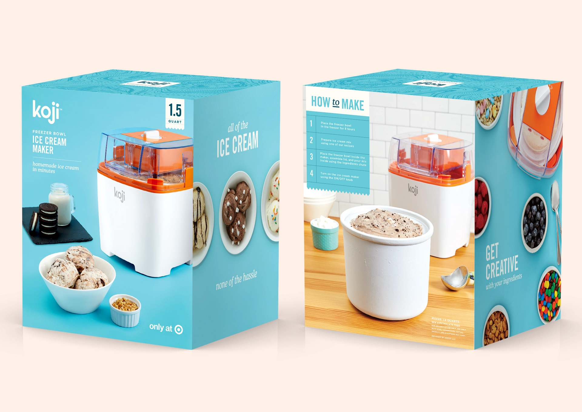
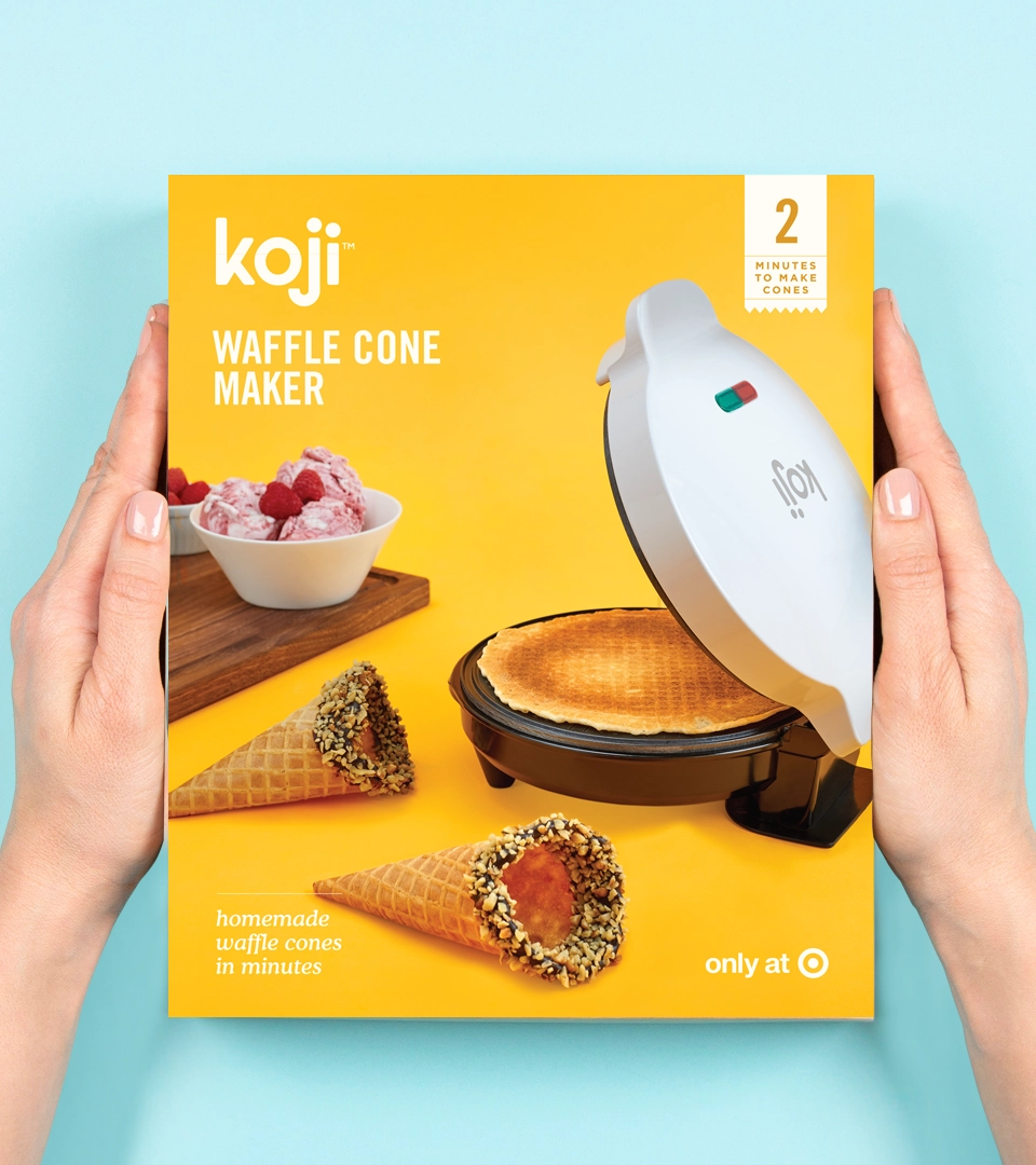
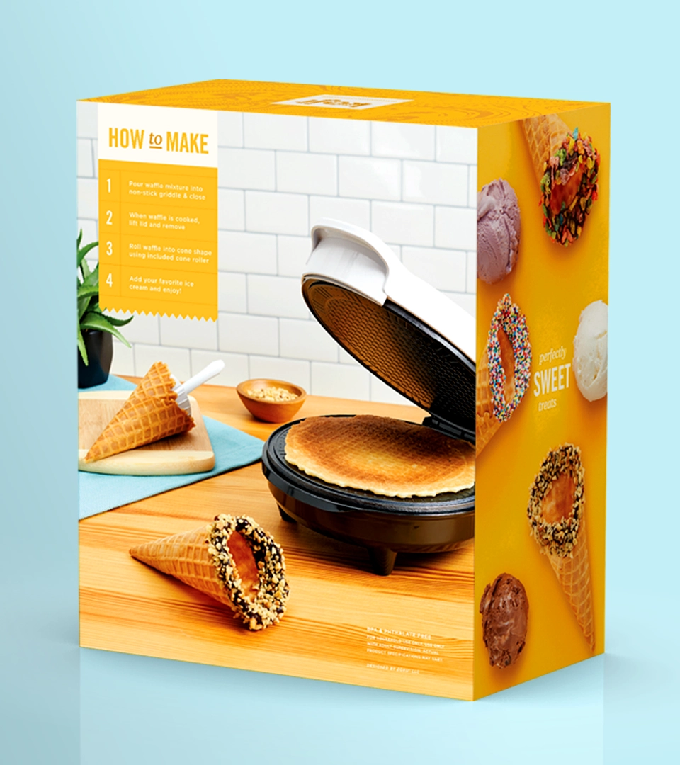
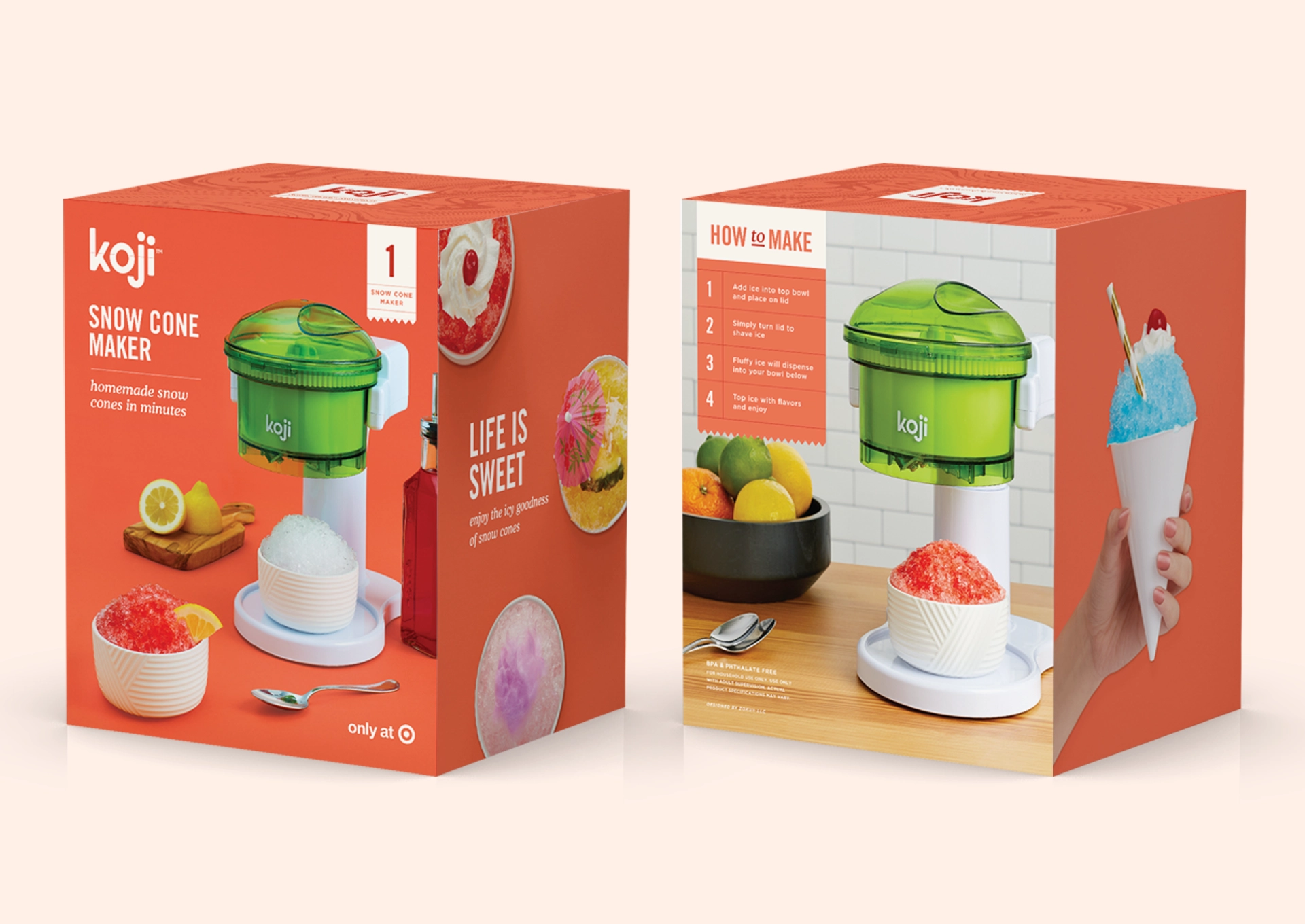
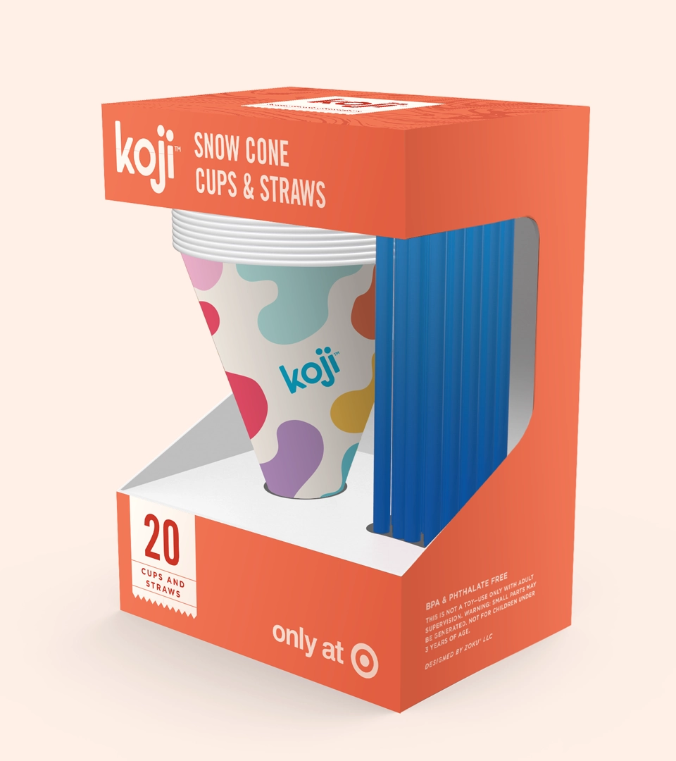
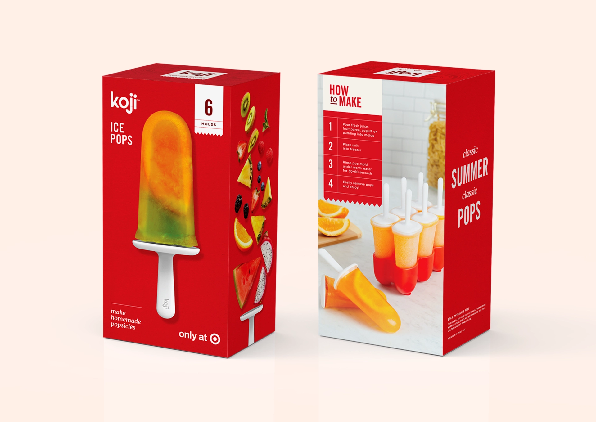
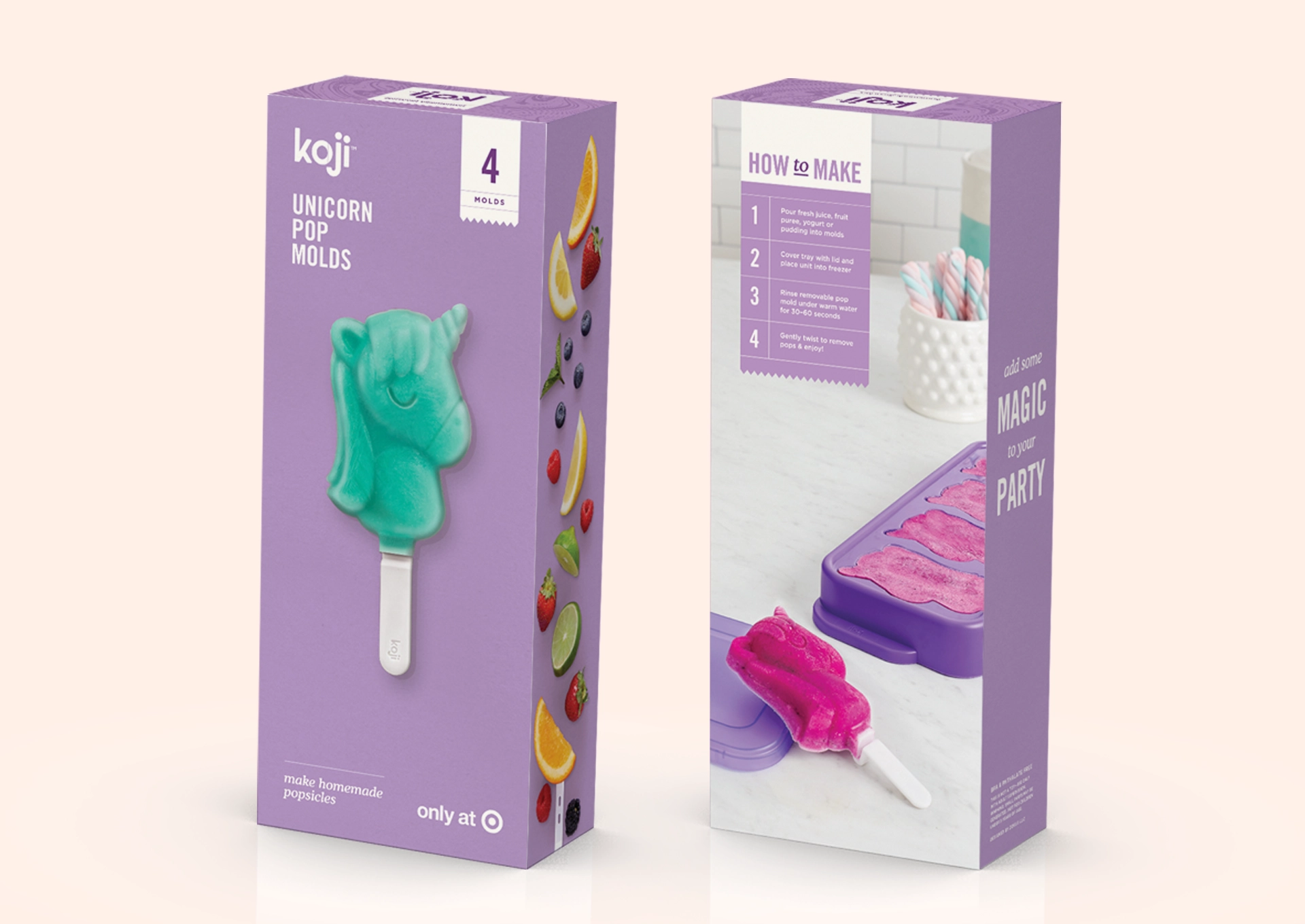
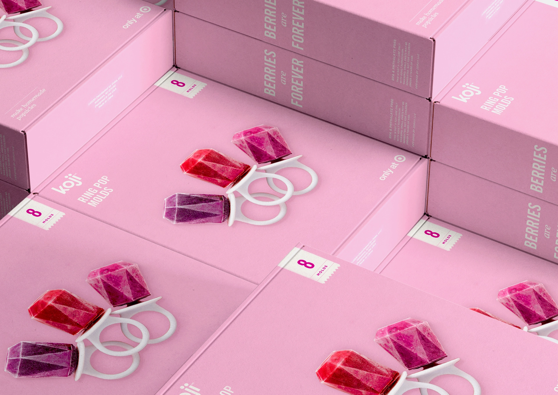
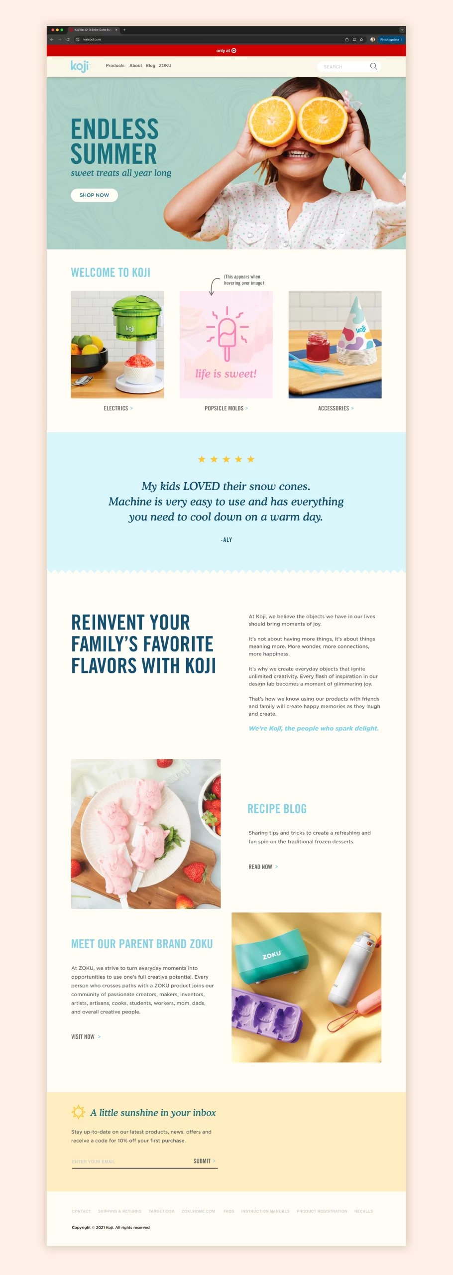
My boss proposed updating Koji’s packaging for the next seasonal collection sold at Target. The previous design used bright colors but lacked meaning, relying mainly on imagery and large promotional text. Koji’s brand is about sparking joy and evoking the feeling of an endless summer. I wanted the new design to have more personality and nostalgia while capturing the carefree spirit of childhood summer vacations.
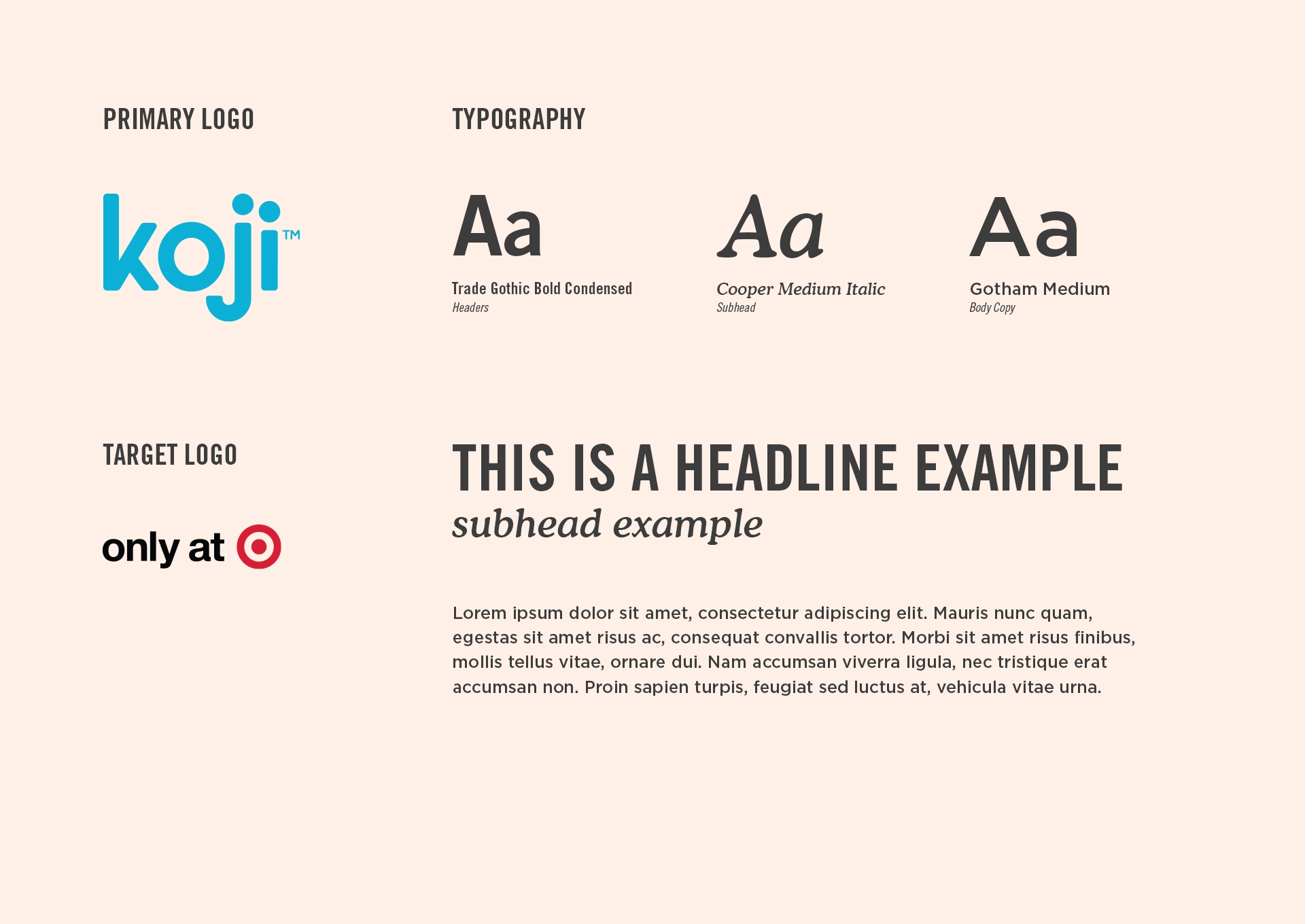
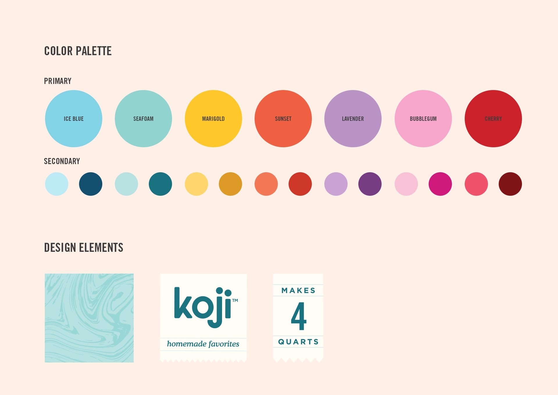
For this project, I defined the color palette, typography, photography direction, and overall design elements. I researched what content should go on each panel to align with competitors and appeal to our target market. I participated in regular design reviews, gathered feedback, and art-directed the photoshoot to ensure the visuals captured the brand’s joyful, endless-summer vibe. The project timeline was two months and ended with production and approval from Target, all while staying within budget and time constraints.
Packaging
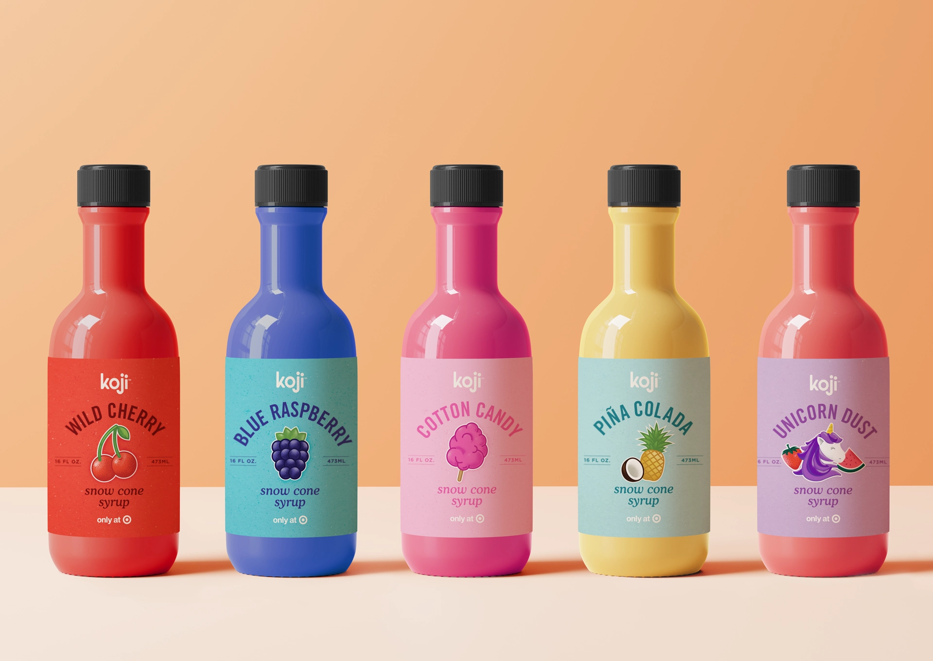
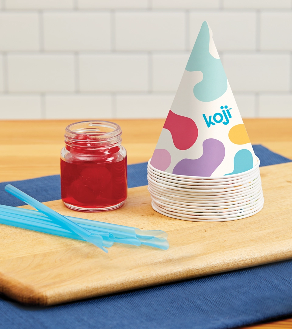
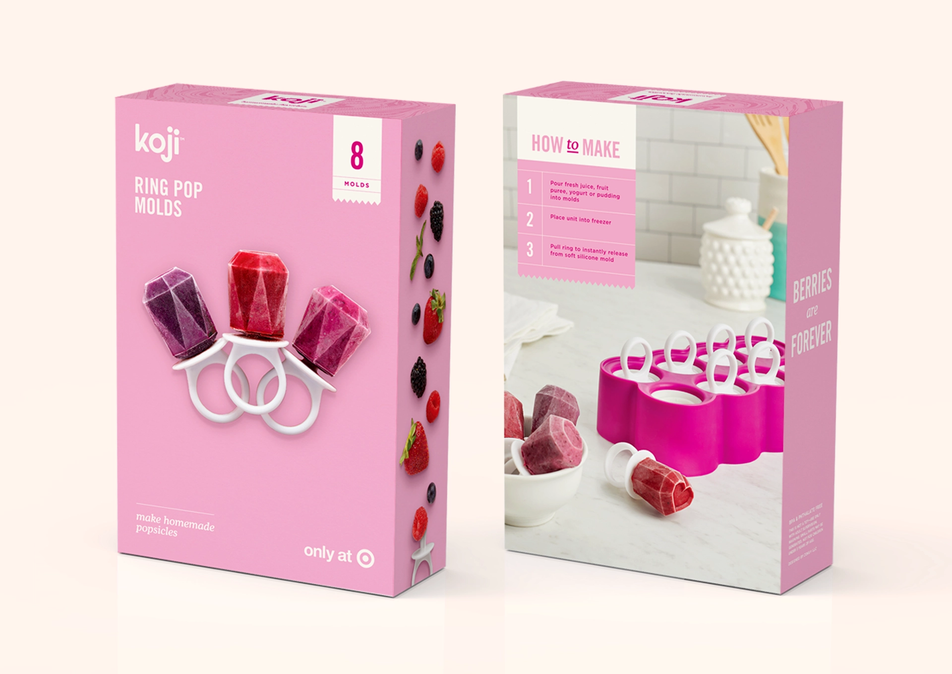
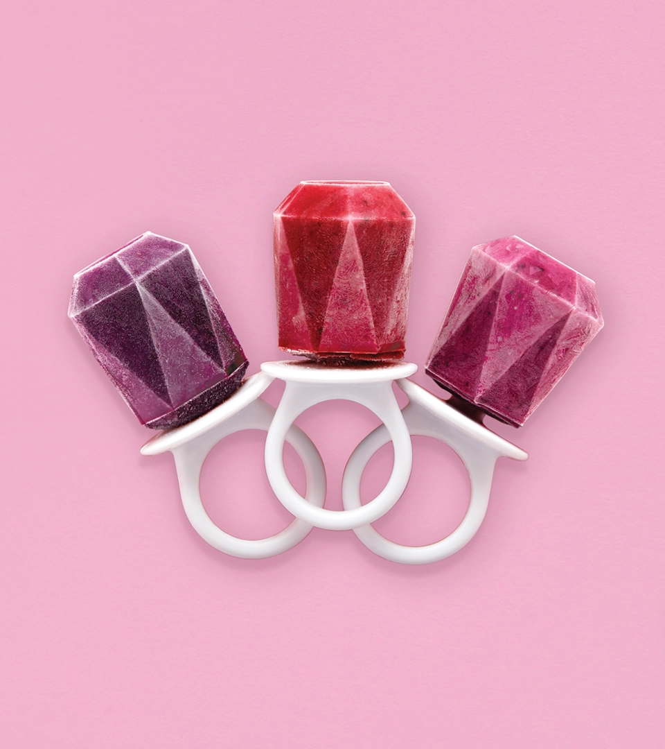
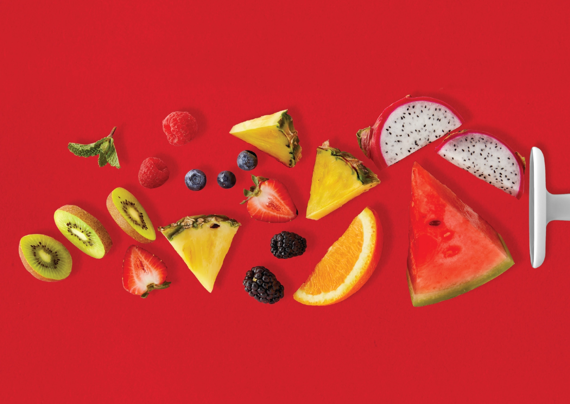
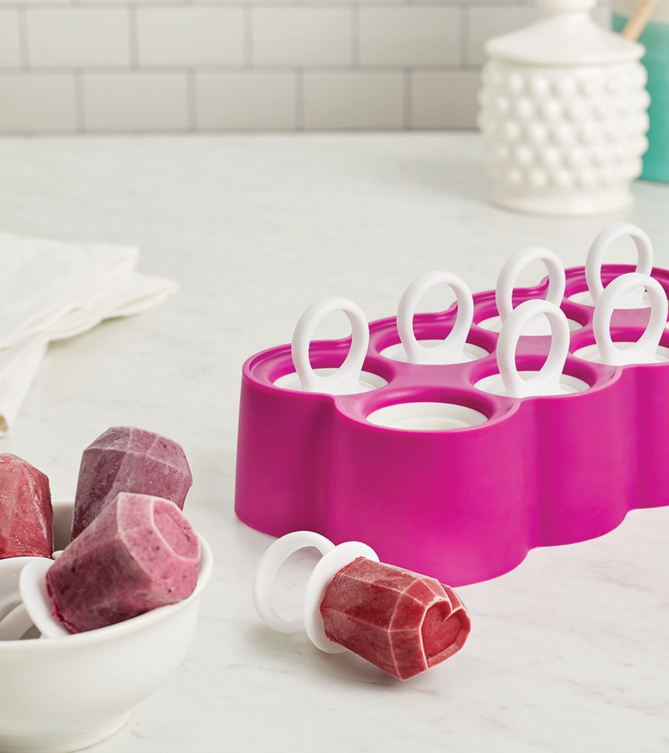
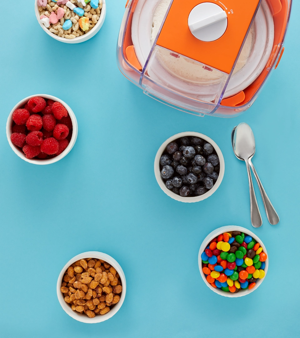
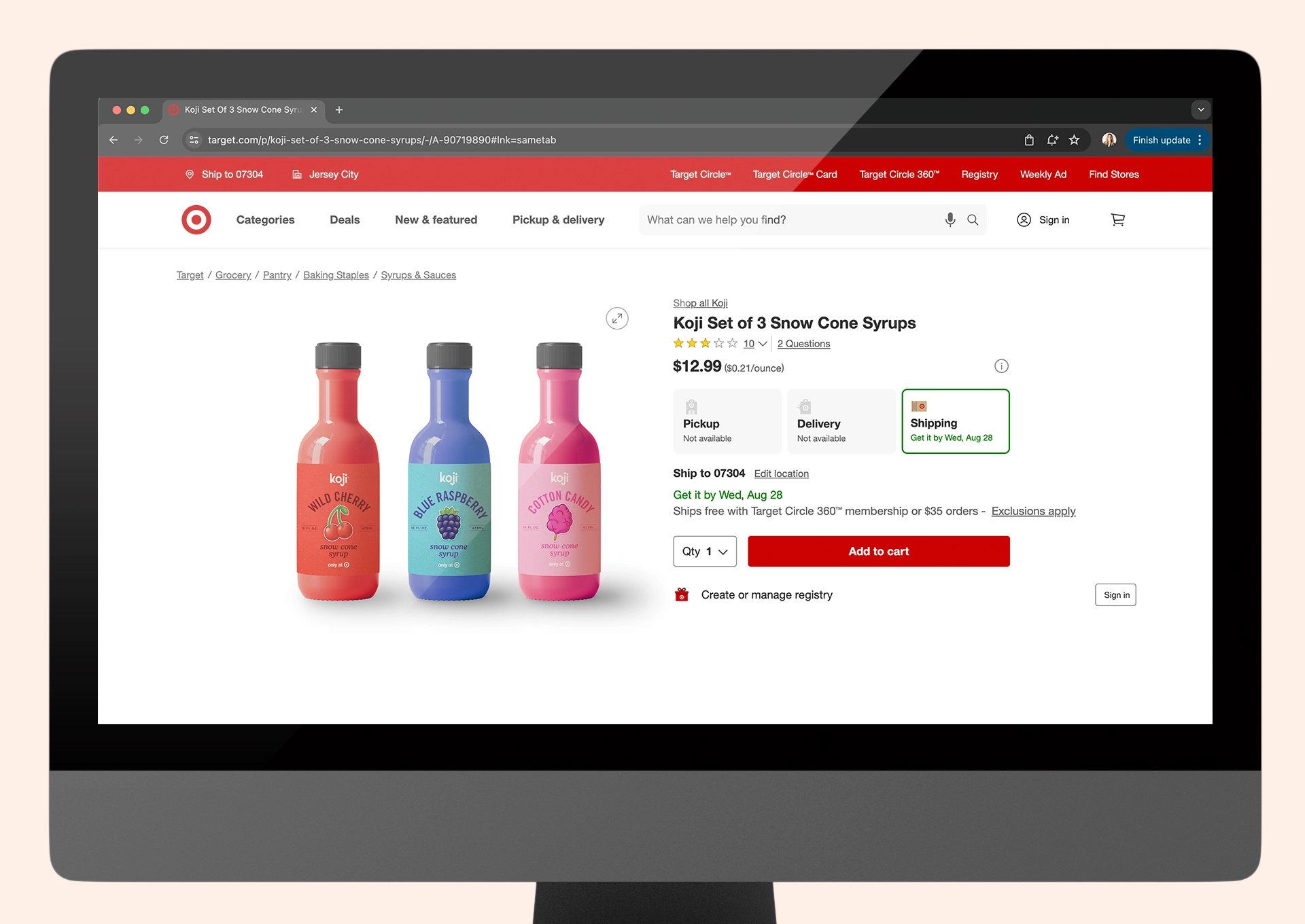
We chose bold, bright colors for the packaging to bring to mind those sunny, carefree days. Playful food elements are woven into the design to inspire creativity as you make your frozen treats. The lifestyle photography is minimalistic, capturing the essence of simplicity and fun.
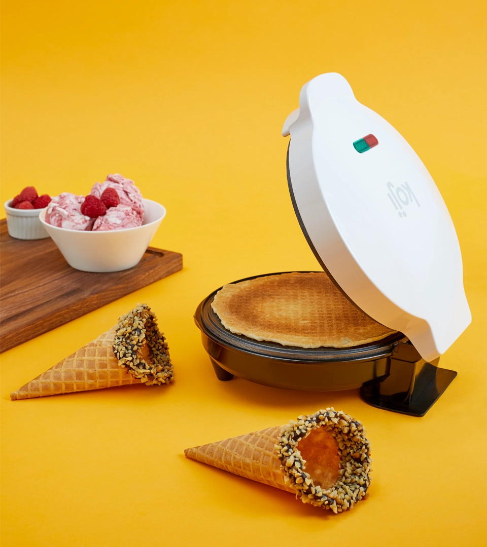
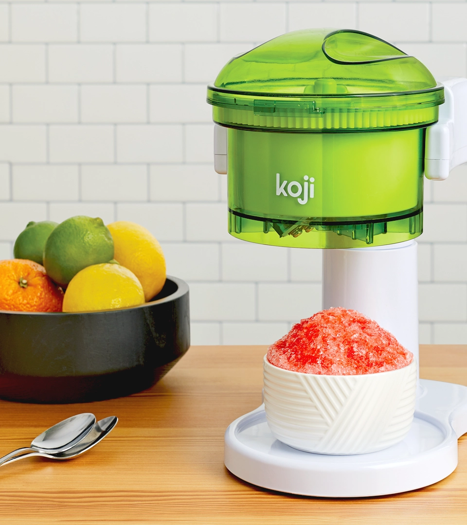
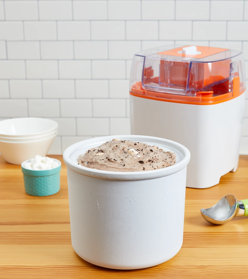
Photography

Website
Although Koji is exclusively sold at Target, I created a website to provide more information about the brand. I felt it was important for consumers to have a dedicated space to learn more about Koji, find answers to any questions, or address any concerns they may have about the product.
Collaborators
Product Design and Graphic Design: Takashi Kono
Marketing: Brian Crandall
Photography: Melissa Goodwin